Why Empty Space Can Make a Picture Feel Full
See how empty space in a picture directs attention, links forms and creates a sense of movement, distance or quiet without adding another object.

Why can a picture with very little in it still feel full? Empty space in a picture is not simply what remains after the objects are placed. Its shape, position and size can draw the eye, set forms against one another and give a composition its particular tension or calm.
1. Read the space as a shape
Look first at the unoccupied areas, rather than naming the objects. The gap between a vase and the edge of a table, for instance, has a contour of its own. It may widen near the top, taper towards the bottom or form a narrow channel between two larger shapes. That contour contributes to the picture just as the outline of the vase does.
Artists and designers sometimes call these areas negative space. The term does not mean that the space is unimportant. It simply distinguishes the forms that appear occupied from the areas around and between them. In practice, the two keep changing our perception of one another: a bent arm makes a crescent of space; that crescent, in turn, makes the bend easier to see.
Try tracing the empty shapes with your eyes. Do they look broad and rounded, sharply angled, or pinched into slivers? This approach can reveal a composition’s underlying rhythm before its subject matter takes over. A row of objects might seem irregular when considered separately, while the repeated gaps between them create a clear pattern.
When a picture feels crowded, inspect the contours of its gaps before deciding that it needs fewer objects.
2. Use the gap to guide the eye
An unoccupied area can act as a route through a composition. A pale opening between dark forms may lead the eye upwards; a diagonal strip of ground can carry it from a figure towards a distant building. The space need not contain a drawn line. Its borders can suggest a path strongly enough for the viewer to follow.
Direction matters. A gap that points towards a face or a significant object can focus attention there. If its widest end sits beside the focal area and its narrow end leads away, the narrowing can feel like a visual approach. Reverse that arrangement and the same gap might seem to open out, releasing attention towards the edge.
Imagine a painter arranging a dark tree trunk on the left and a small, brightly coloured bird on the right. If the clear patch between them narrows towards the bird, the space may direct the eye to the bird without an arrow or a conspicuous gesture. If the opening broadens instead, the viewer may notice the interval itself before settling on either form.
Follow the gaps as if they were quiet paths, and notice where they deliver your attention.
3. Let distance create a relationship
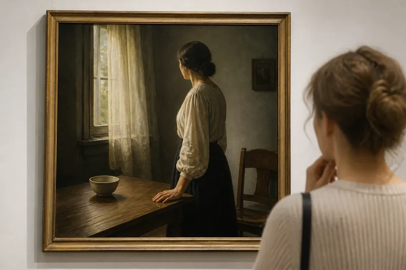
Space does not only separate forms. It can make them appear connected, opposed or indifferent to one another. Two figures with a narrow interval between them may seem to share a moment, even if neither touches the other. A larger gap can make them feel isolated, while a gap that is almost closed may create an expectation of contact.
These impressions depend on the forms as well as the distance. The direction of a figure’s gaze, the angle of a chair or the lean of a branch can make an empty interval seem charged with attention. If two people face one another across a table, the tabletop between them may read as a meeting place. Turn them away, and the same expanse can feel like a barrier.
Pay attention to the edges facing into the gap. Parallel edges can suggest a measured relationship; edges that converge may make the interval feel compressed. A small change in contour may alter the implied connection, even when the objects remain in their places.
Ask what the interval seems to connect, not only what it keeps apart.
4. Change scale to change the mood
The amount of open area around a form affects its apparent weight. A small object surrounded by a broad field can appear vulnerable, remote or unusually important. A large form pressed close to the boundaries can seem forceful or confined. These are not fixed meanings; they are effects shaped by colour, subject and the rest of the composition.
Compare the same mark placed in two different settings. In a crowded arrangement, it may become one element among many. Against a quiet field, its edges become easier to inspect, and even a slight tilt may seem significant. Empty space can therefore intensify a detail without changing the detail itself.
Scale also changes the balance of a picture. A broad area on one side may be countered by a compact, visually strong form on the other. The balance need not be symmetrical. A single dark shape can hold attention against a much larger, pale opening because contrast and placement influence how much visual weight each area seems to carry.
When assessing balance, compare the force of the forms with the area around them, not just their physical size.
5. Make open space feel shallow or deep
Empty areas can suggest distance even when no object occupies them. Overlapping forms, changes in scale, shifts in colour and converging edges can make a gap seem to recede. A clear strip between a foreground shape and a smaller distant form may read as ground or air, depending on the surrounding cues.
Flatness is a different possibility. In a poster, print or abstract composition, a uniform field may remain a surface rather than become a view into depth. Strong outlines and evenly applied colour can keep the empty area close to the picture plane. Neither effect is more successful by itself; the question is whether the space supports the kind of composition being made.
Look for clues at the boundary. A form partly hidden by another tends to sit behind it, while a gap that changes tone across the picture may seem to recede. If every empty area is treated the same way, depth can become confusing. Clear differences between flat fields and receding passages help viewers understand how the forms relate.
Notice whether the space behaves like a surface, a passage, or a distant view.
6. Use open areas to set a pace
Repeated intervals can establish rhythm. In a still life, similar gaps between cups may make the arrangement feel measured. Uneven intervals can disrupt that regularity and make one object stand out. The spacing is not merely a background choice: it sets the pace at which the eye moves from form to form.
Artists can also use a larger pause to interrupt a sequence. Imagine a designer placing three small leaf shapes close together, then leaving a wider interval before a single larger leaf. The cluster would likely read as a group, while the pause could give the last leaf a separate emphasis. The result depends on the silhouettes, but the change in spacing supplies a clear cue.
Small repeated gaps often feel quick or continuous; broad breaks can slow the eye. A composition may combine both, much as a sentence uses short phrases and pauses. Look for where the spacing changes, then consider what that change asks you to notice.
When a pattern feels monotonous, a deliberate change in spacing may be more effective than adding another form.
7. Check the composition from more than one distance
At close range, small intervals and fine edges become visible. Step back and those details combine into larger patterns of light, dark and colour. A narrow opening that looks incidental up close might form a strong diagonal across the whole picture. Conversely, a carefully drawn gap may disappear at a distance if it is too slight to hold its contrast.
For a drawing or layout in progress, squinting can simplify the image into broad value masses. A thumbnail sketch can do something similar: it helps reveal whether the open areas still direct the eye when detail is reduced. Turning the work upside down can make familiar objects less distracting, so the arrangement of shapes becomes easier to judge.
Say you are drawing a seated person beside a window and the figure’s shoulder nearly merges with the frame. At normal viewing distance, the two may read as one dark block. If you widen the visible gap slightly in a small sketch, the shoulder and frame may separate clearly, while the figure still appears close to the window. The useful decision is not to enlarge every gap, but to preserve the particular interval needed for the forms to remain legible.
Compare a detail view with a simplified view before deciding which gap needs attention.
Questions about empty space in a picture?
What is negative space in visual art?
Negative space is the unoccupied area around and between the forms in a composition. Looking at its outline can reveal patterns and relationships that are harder to see when attention stays on the objects alone.
Does empty space always make a composition calmer?
No. A broad, quiet field can feel restful, but a narrow gap between forms may create tension or suggest imminent contact. The effect depends on how the space is shaped and what surrounds it.
How can I tell whether a gap is too small?
Check whether the neighbouring forms remain distinct at the distance from which the picture will be seen. If their edges merge or their silhouettes become unclear, the interval may need more definition, though contrast or contour changes could also solve the problem.
Can a picture be full without many objects?
Yes. A small number of forms can make a composition feel rich when their spacing creates clear routes, contrasts or relationships. Empty areas contribute to that fullness by giving each shape a particular setting and weight.
Look for the interval that does the work
When you next study a picture, choose one empty area and follow its edges. Notice whether it directs your gaze, sets a distance between forms, balances a dark shape or changes the pace of the composition. Empty space in a picture becomes easier to understand when you ask what its particular shape is doing, rather than treating it as unused background.
That question is useful for making as well as viewing. If an arrangement feels unclear, try adjusting one interval and observe which relationship changes. Sometimes the most revealing alteration is not another object, but a little more room for the existing forms to speak distinctly.